Case study
Explore Page Content Redesign
Company: AbleTo
Role: Senior Content Designer
Team: Product Designer, Product Manager. Senior Director of Content Design, Manager of Clinical Program Development
Background
The Self-Care pod at AbleTo, responsible for designing all shared features across products in our consumer app, identified a problem with the Explore page: users were not engaging with content on Explore. Many visited, but bounced without opening an activity. They reported not knowing where to start or not finding what they were looking for.
So, we set out to rethink how we organize, categorize, and label content on our Explore page to make it easier for our users to browse and find activities that interest them.
My Process
Step 1
Group Workshop
Step 2
Design Exploration
Step 3
Collaboration & Iteration
Step 4
User Testing
Step 5
Final Design
Step 1
Group workshop
Workshop goals:
Understand competitors’ strategies
Uncover known and perceived user needs
Ideate on different ways to organize content
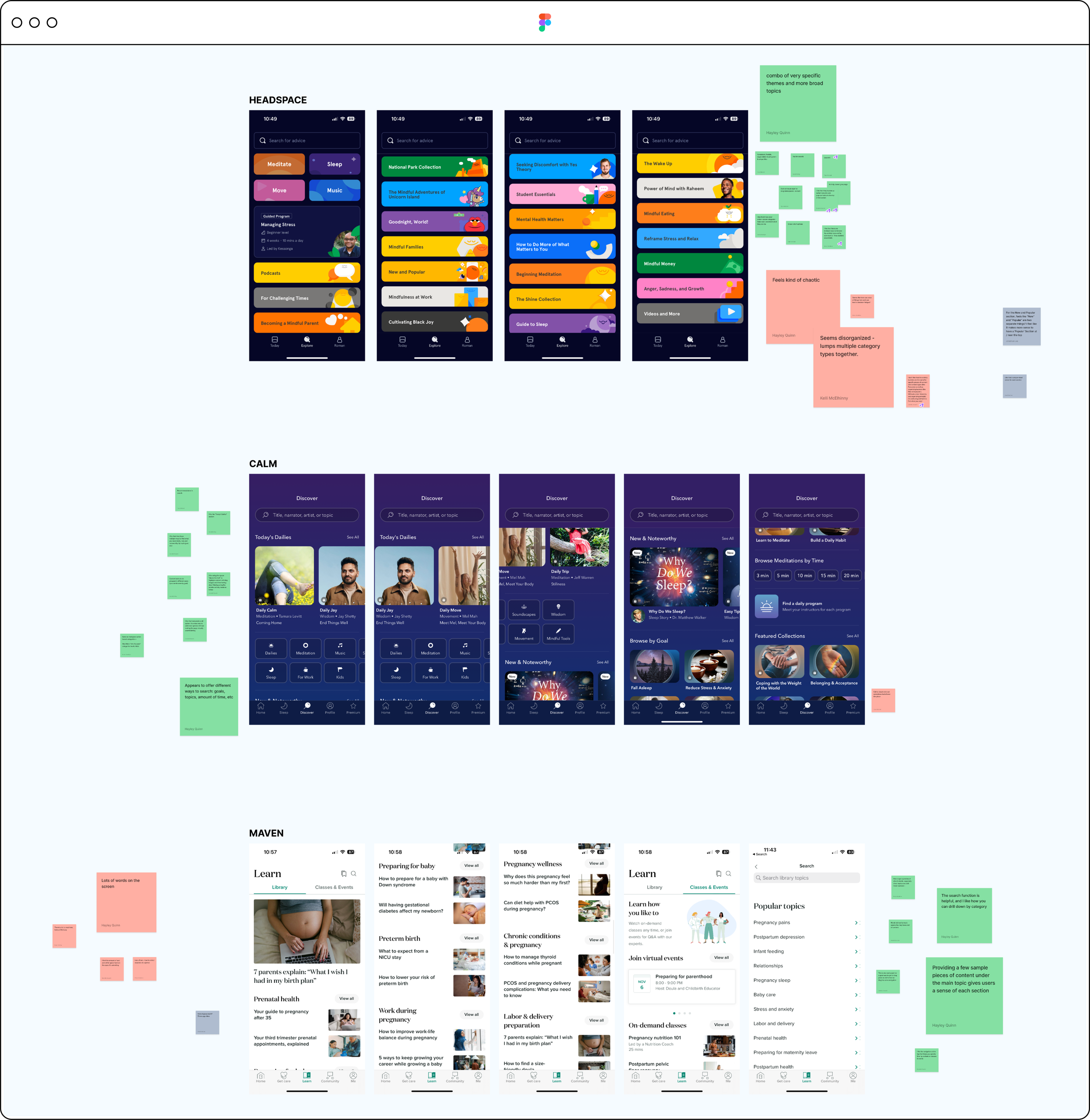
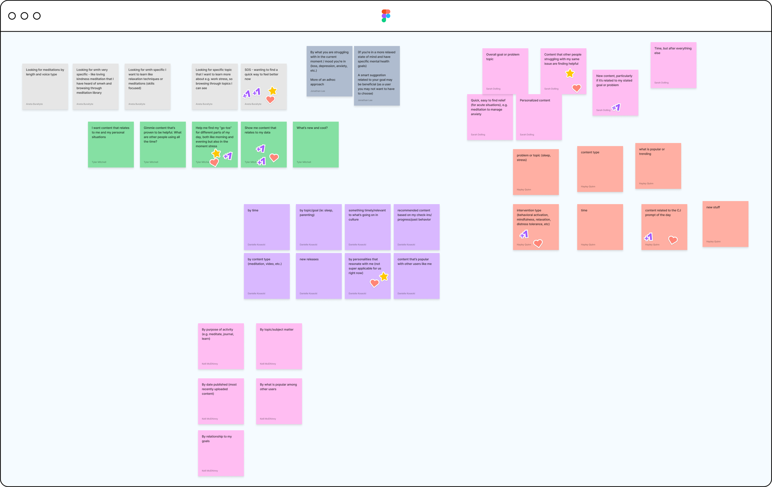
1. Competitive analysis
As a team, we reviewed competitors like Calm, Headspace, Maven, and Bloom. I asked the team to identify what’s working and not working and what they liked and disliked about their pages’ categorization and structure.
2. User needs
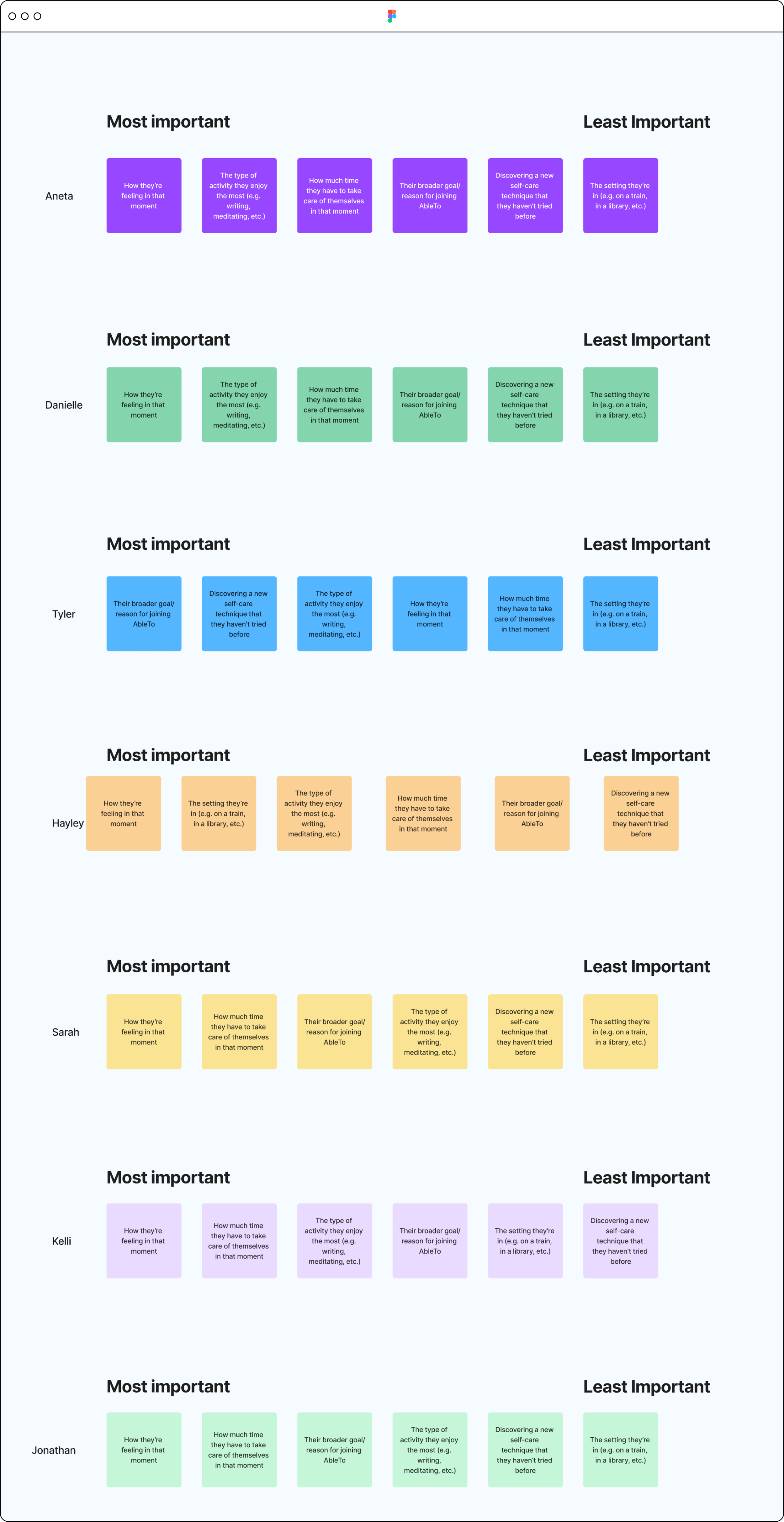
Then, I ran a mini card sort to identify the team’s hypotheses around what’s most important to our users. I came up with these six items based on past user research and my own hypotheses of what may influence engagement (to augment what we knew from research).
3. Ideation
Finally, I asked the team to rapid fire ideate as many ways as possible to sort and categorize our Explore page content, keeping in mind what we learned from competitors and our mini card sort.
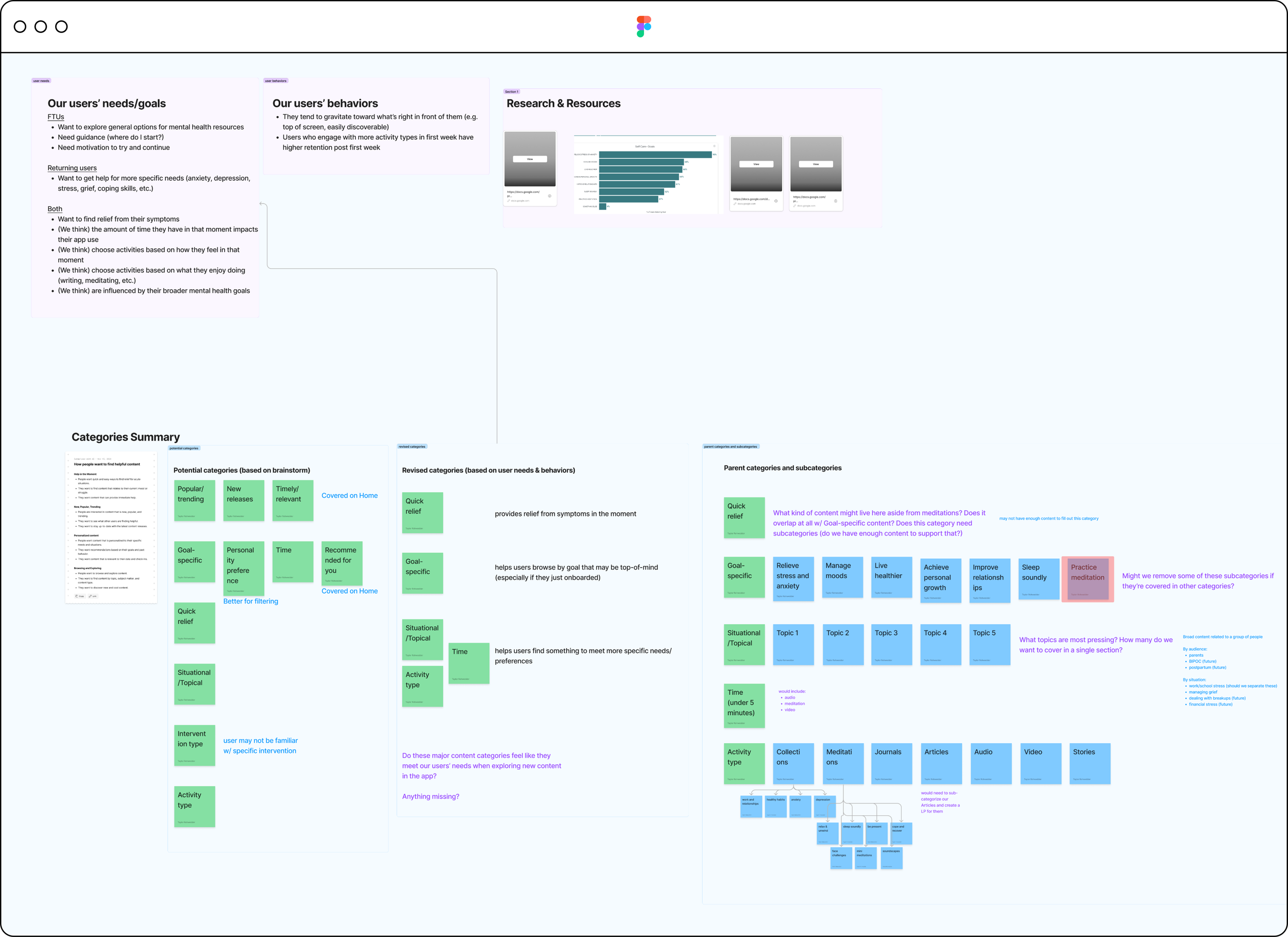
Workshop Synthesis
After the workshop, I synthesized on my own with the help of new Figjam AI tools. First, I identified do’s and don’ts we want to carry forward based on what our team identified in the competitor analysis exercise.
Do’s and Don’ts
Do
Make navigation easy
Bring variety to categories
Highlight what works
Don’t
Overwhelm visually
Be chaotic with categories
What’s most important to users
Then, I synthesized the card sorting exercise, which helped us hypothesize what’s most important to our users, to inform categories and their order. I did this by organizing cards based on how many workshop participants placed a certain card in a given category.
1. How they’re feeling in the moment
2. How much time they have
3. The type of activity they enjoy most
4. Their goals/reasons for joining
5. Discovering new self-care techniques
6. The setting they’re in
Research learnings
Finally, I compared our hypothesized needs with existing user research to confirm what our users want and need from our app. That research taught us a few things about first-time users and returning users, and our Explore page needed to meet the needs of both.
FTUs:
Want to explore general options for mental health resources
Need guidance (where do I start?)
Need motivation to try and continue
Returning users:
Want to get help for more specific needs (anxiety, depression, stress, grief, coping skills, etc.)
Step 2
Design Exploration
Categorization
First, I organized brainstormed ideas into rough content categories to start.
Next, I narrowed down categories based on identified and perceived user needs, while considering other content categories across the app (particularly on Home).
Then, I consulted with our clinical content specialist to review categories, identify those that may require sub-categories to support them, and decide whether we had enough existing or planned future content to support each category. I removed any that could not be supported now or in the near future based on our content calendar.
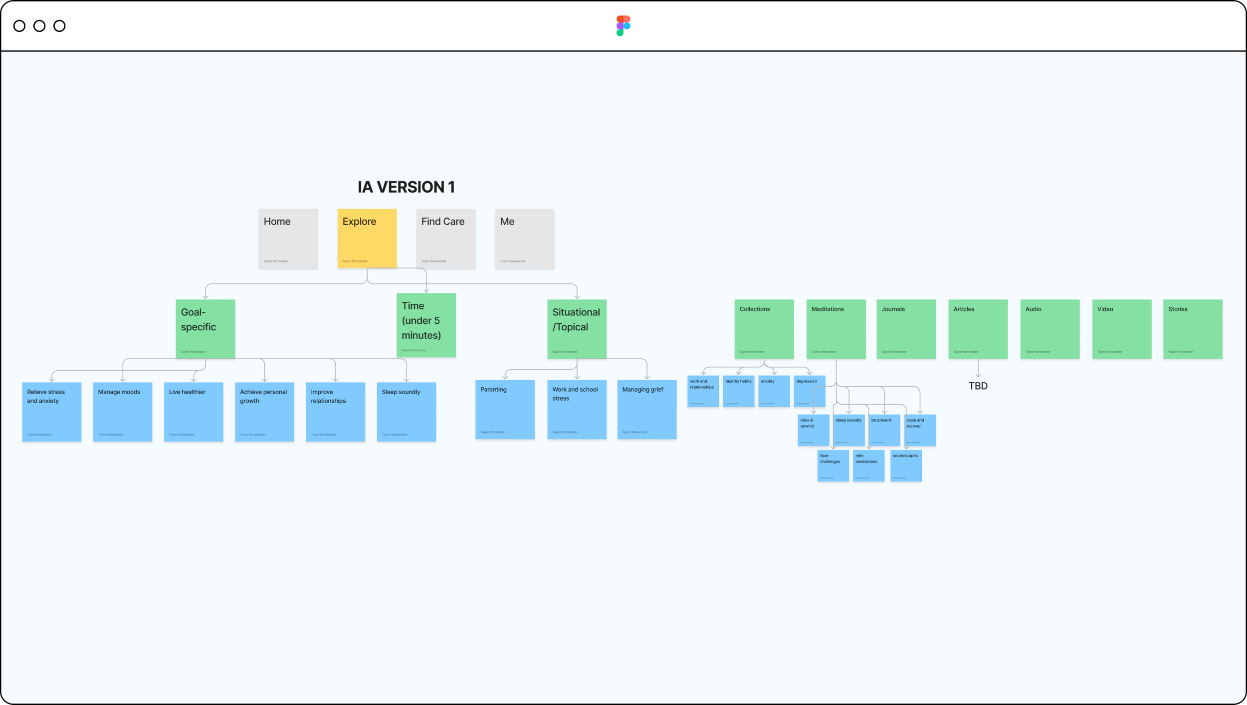
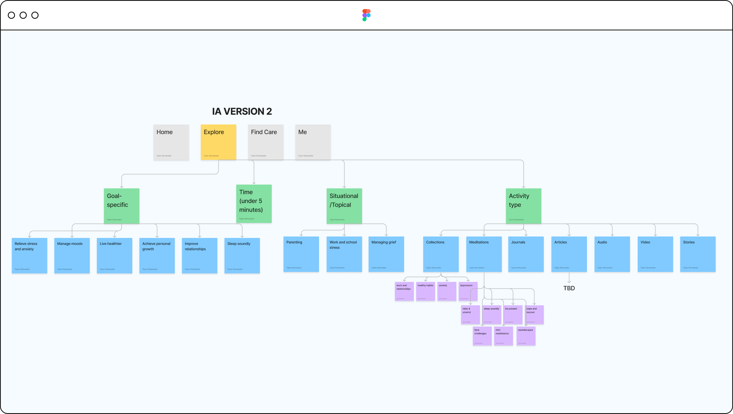
Information Architecture
Here’s a closer look at where we tentatively landed in this round.
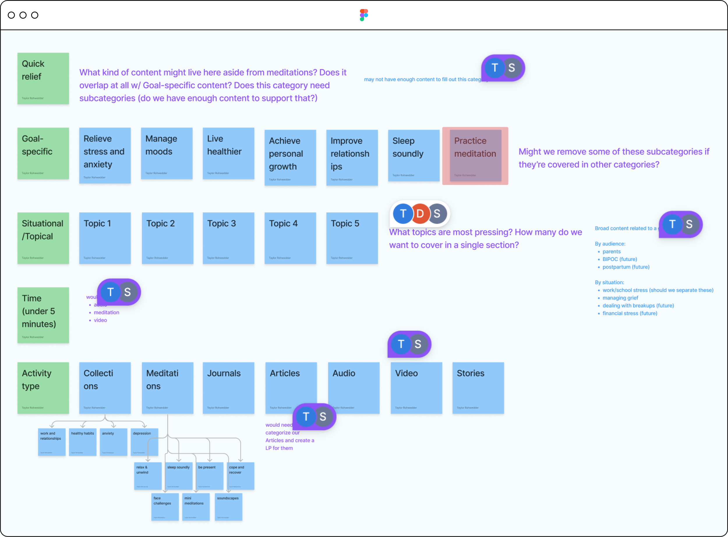
Information Architecture (Option 1)
From there, I explored different ways to map the page’s information architecture to support our new categorization. I came up with 3 options:
Option 1: gave the most visibility to each category, with room for content previews beneath each. However, it meant a long vertical scroll that may overwhelm users.
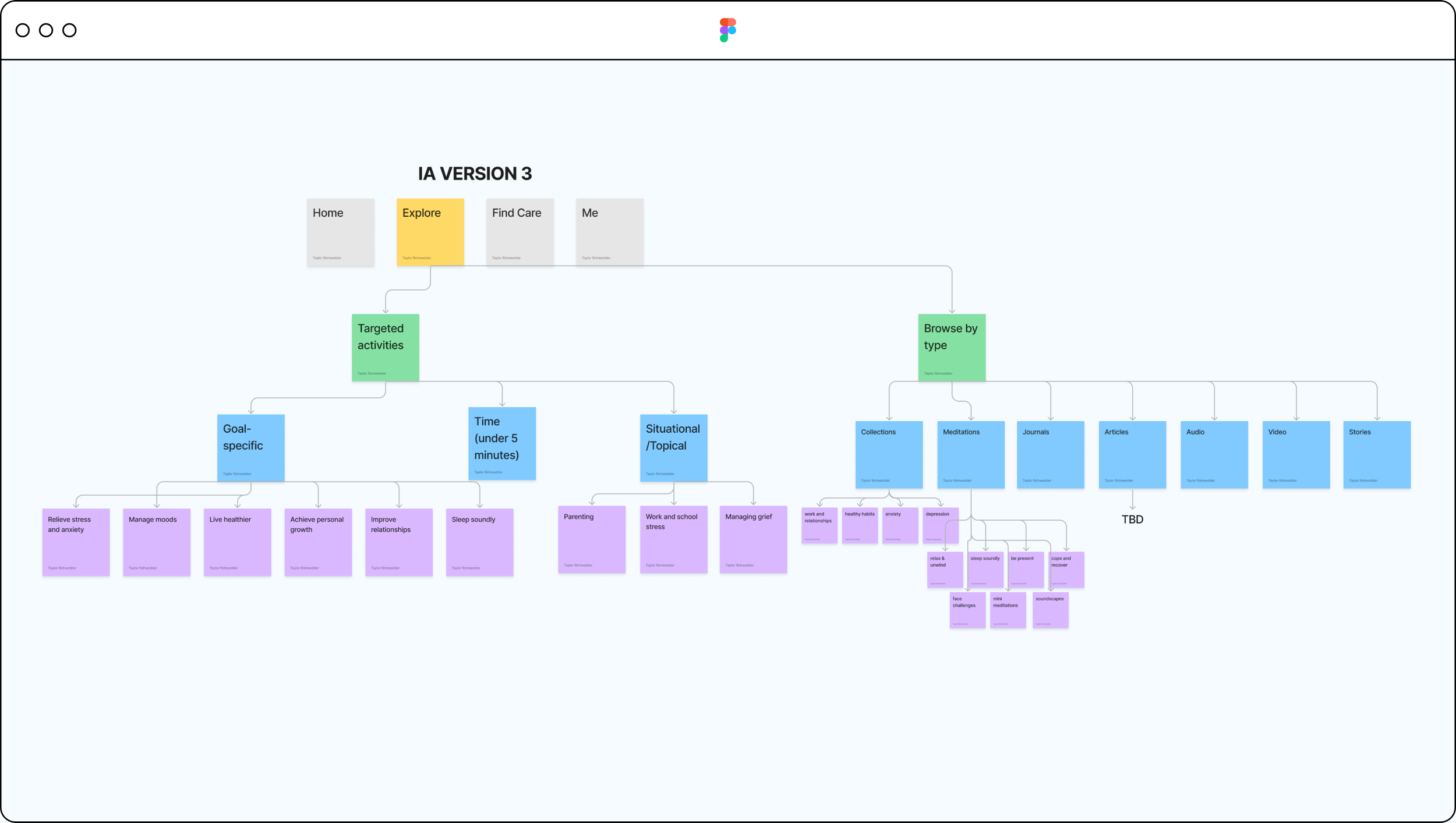
Information Architecture (Option 2)
Option 2: similar to option 1, but I collapsed the last category into a parent/child category to limit vertical scroll. It did, however, also limit our ability to preview content within each category, so users might not know what to expect from child categories.
Information Architecture (Option 3)
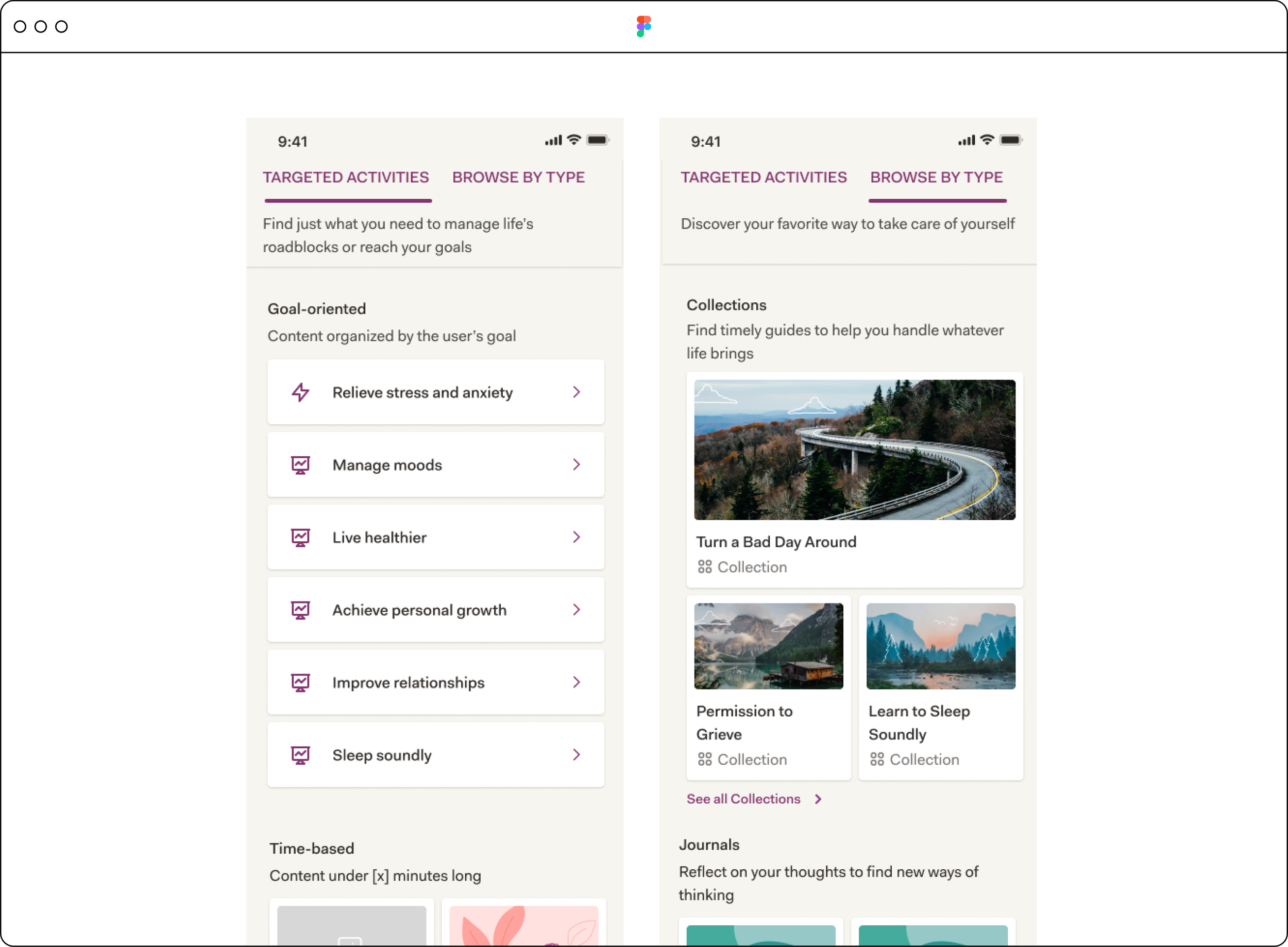
Option 3: used a tab functionality to separate content into 2 distinct buckets: targeted activities (meaning those targeting specific needs) vs activities by type (organized by their function: i.e. meditation, journal, etc.). This helped limit a long vertical scroll on either tab, but would require users to have a sense of what they’re looking for first.
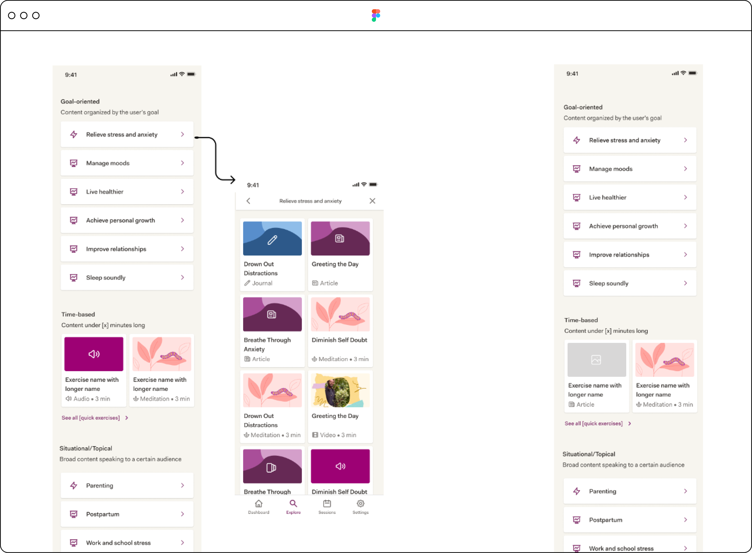
Wireframe: Version 1
From there, I started to explore UI options for each IA to determine how we might display these categories using our existing design system. Exploring IA option visually would also help the team better understand the pros and cons of each and make an informed decision about which to move forward with.
Wireframe: Version 2
Wireframe: Version 3
Step 3
Design Iteration
I brought my IA diagrams, along with UI mockups to design critique and back to our smaller working group for feedback and iterated from there. The teams agreed that we needed to feature our most popular content above the scroll and feature short (under 5 minute) activities as a low barrier to entry.
Summary of changes
Added a “popular topics” category to the top of the page
Moved our most popular activity type, meditation, to this category
Created a subcategory for sleep under popular topics
Added activities under 5 minutes here
Personalized the “goal-oriented” parent category
Kept our most popular activity type categories (Collections, Journals, and Stories) as their own sections, and collapsed other activity types into a parent category
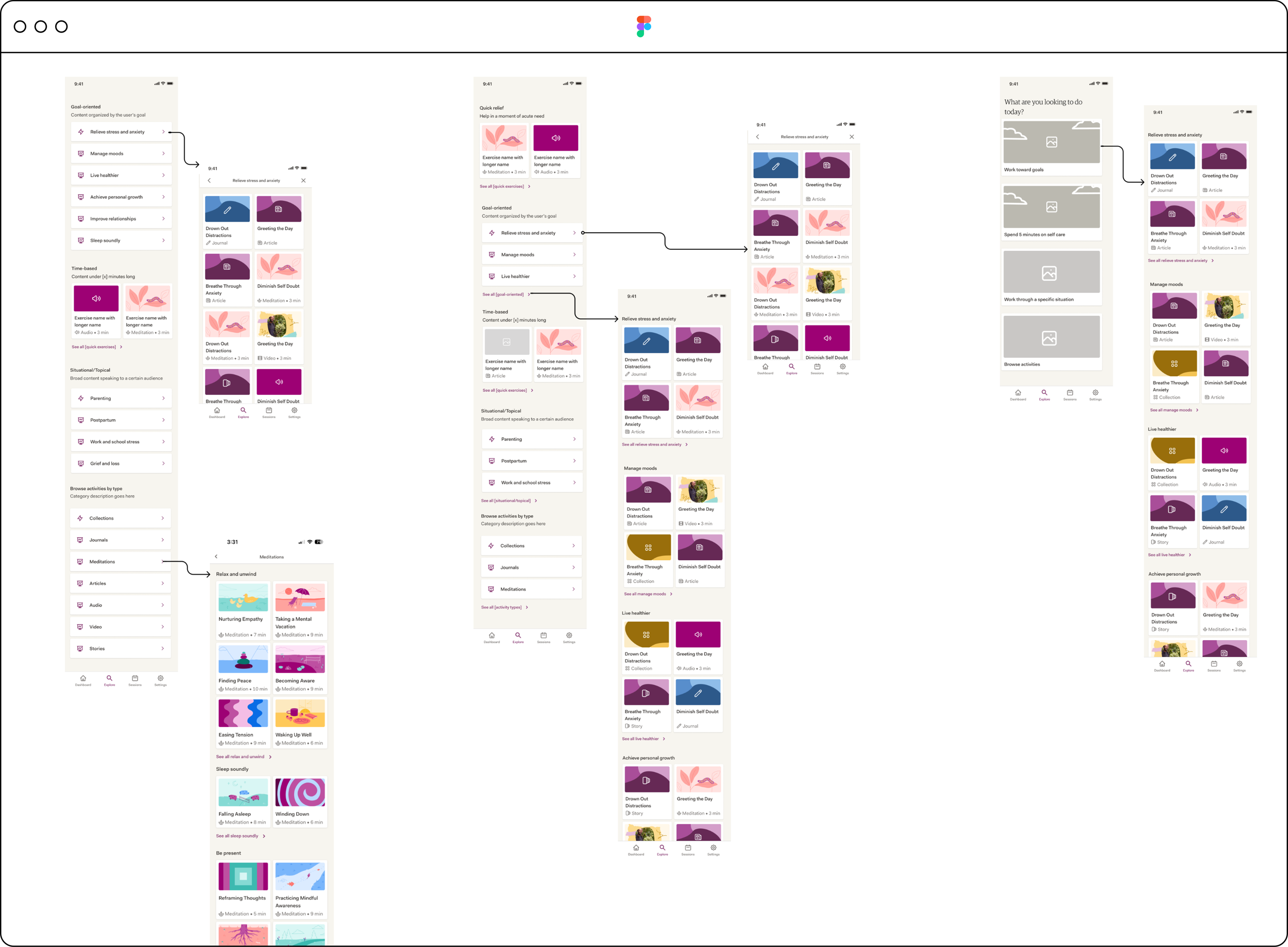
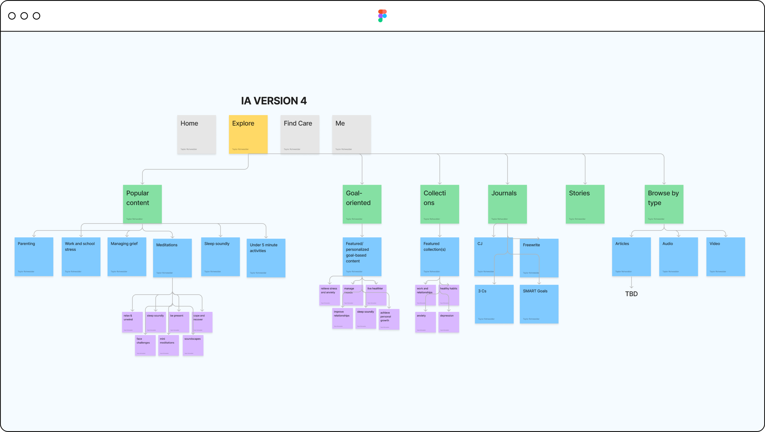
Version 4 - Information Architecture
Here’s what the new IA diagram and visual mockup looked like after considering the team’s feedback.
Version 4 - Interface
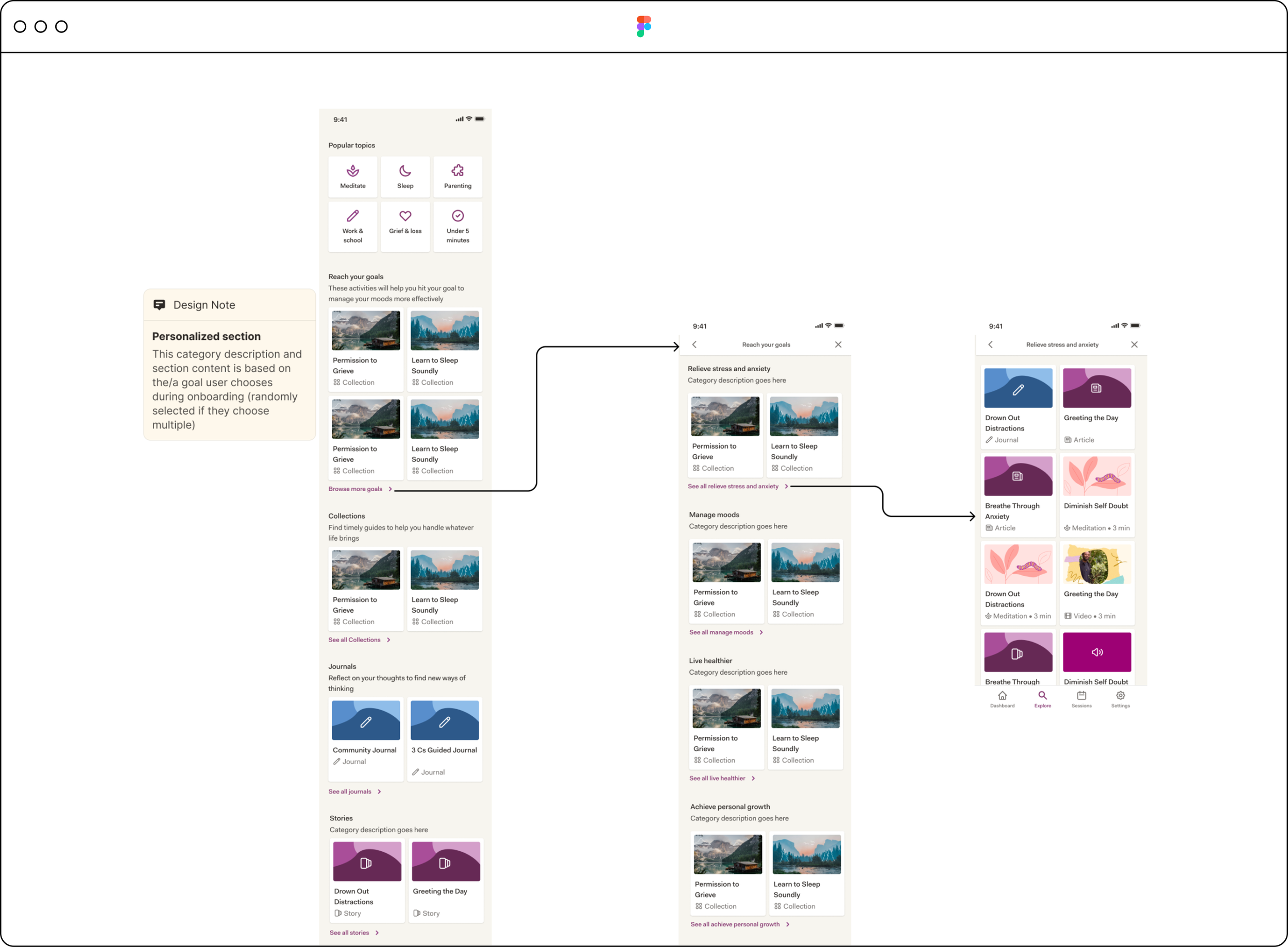
Design Iteration #2
Summary of changes
Removed “popular topics” category header
Removed the personalization from the goal-oriented category, and instead, surfaced the top 3 most popular user goals as subcategories (due to engineering constraint)
Brought in 2 popular “tools” to the Explore page: Habit and Mood Tracking tools
Collapsed these tools into a parent category with Journals, called Self care tools
Refined components in sections: “Reach your goals” and “Looking for something else?”
Step 4
User Testing
We wanted to learn:
How easy is it for users to find an activity that interests them?
How do users respond to the new design and categories?
What can we change, if anything, to encourage users to try more activities from this page?
Does the page meet our users’ expectations?
What do users expect to find when they click into a “See all” link from Explore? How do they expect content to be organized?
Test questions:
What content was most interesting to you and why?
Imagine that you’re looking for content to relieve stress. Where would you find this content?
How much do you agree with the following statements?
It was easy to find an activity that interests me
The content on this app meets my expectations
I find the content categories on this app interesting
I would be likely to try an activity on this app
What would you expect when you click on “See all stories”?
What, if anything, might you change about this page to improve it?
How do you prefer to see information organized?
By goal
By content type
Alphabetically
By topic
By time/activity length
Other (please specify)
Key learnings:
Majority preferred content to be organized by content type or by topic.
Most users had trouble defining exactly what a “story” was.
When asked what content most interested them, many users mentioned content categories above the fold
Most users:
Found it easy to find an interesting activity
Felt that the content within the app met their expectations
Found the content categories interesting
Would be likely to try an activity
Improvements:
Move “Self care tools” higher up on the page
Scroll too long
Make “Under 5 minute” activities even more prominent
Parenting and grief content not applicable to all
Step 5
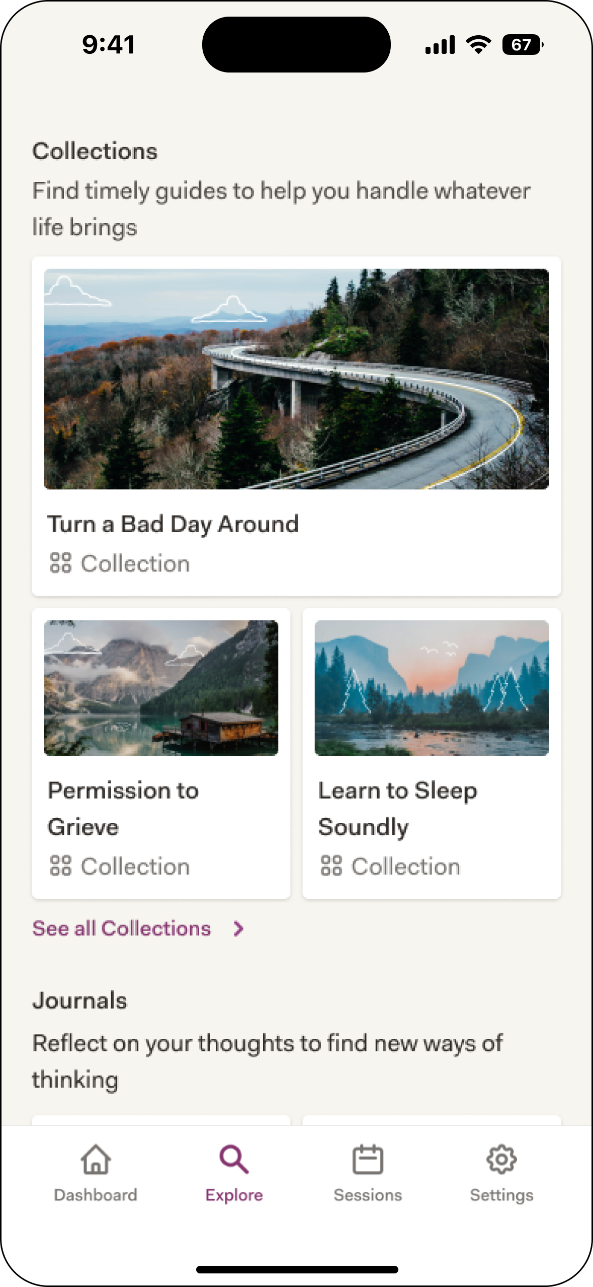
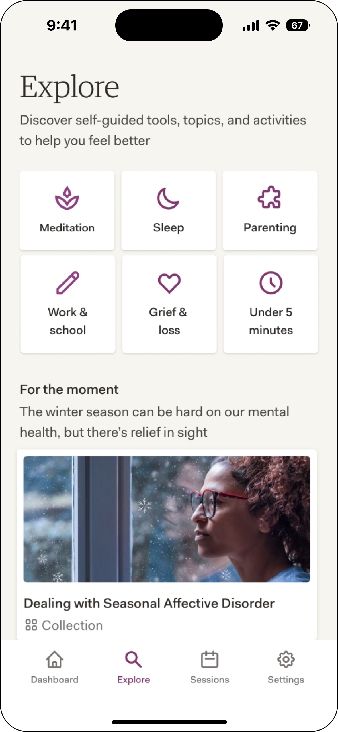
Final iteration & results
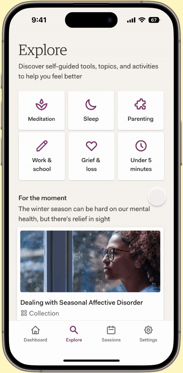
Summary of changes
Moved “5 min fixes” to top row and parenting to bottom
Moved “Self-care tools” section up
Revised “Stories” section description
A/B test results:
20% increase in engagement
Increase in avg. activity types tried from 0-1 to 1-2
Before and After