
Case study
Feature Naming
Company: AbleTo
Role: Senior Content Designer
Team: Product Designer, Product Manager. Senior Director of Content Design, Manager of Clinical Program Development
Background
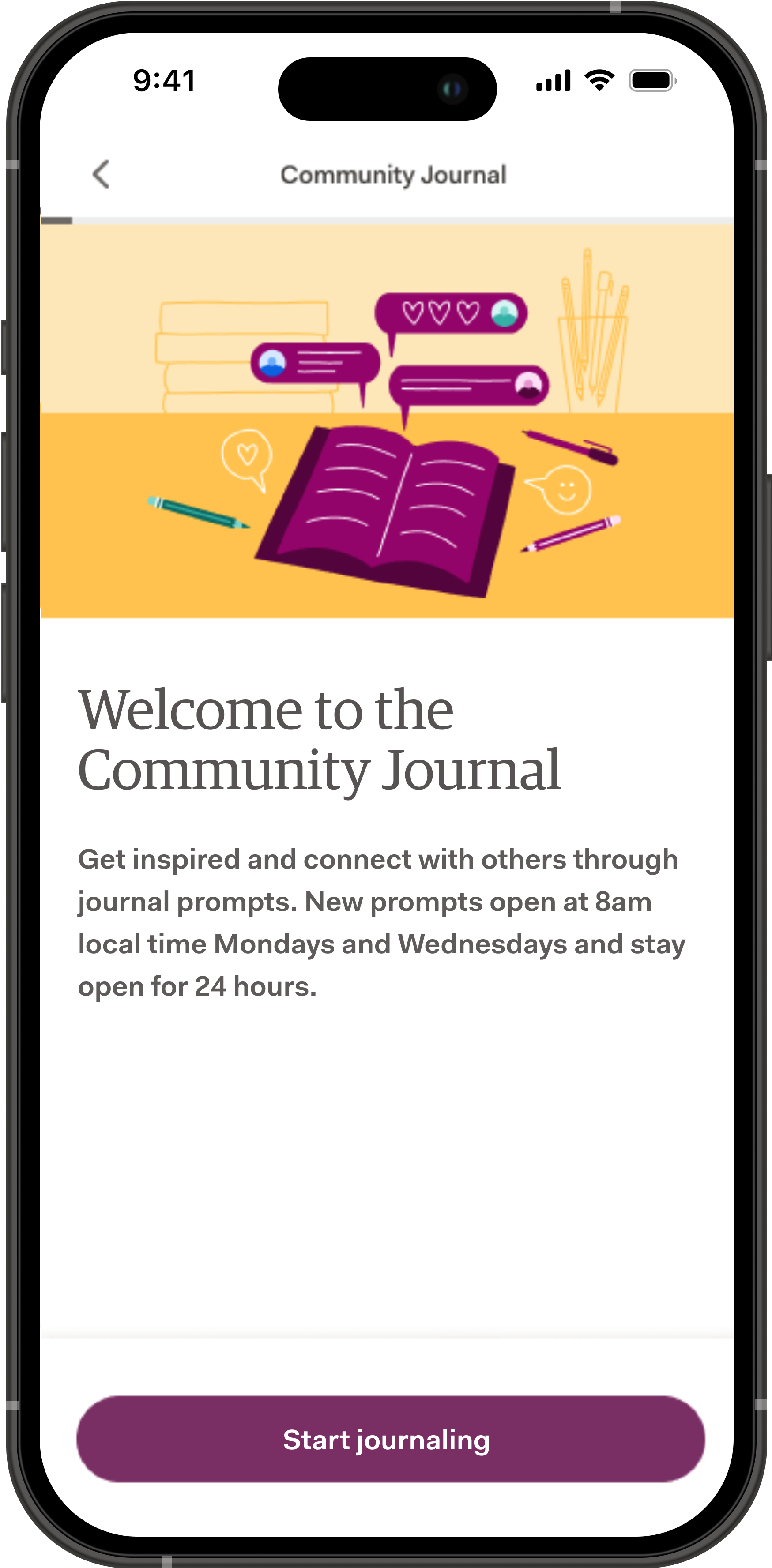
AbleTo, a mental health app rooted in Cognitive Behavioral Therapy and serving over 50,000 participants annually, was launching an important new in-app feature meant to connect users to each other in a productive and meaningful way.
I was tasked with spearheading the naming of this new feature to encourage engagement.
My Process
Step 1
Define Criteria
Step 2
Design Exploration
Step 3
Research & Finalize
Step 1
Defining Feature Name Criteria
As a team, we brainstormed a set of criteria this feature’s name would need to abide by.
Our criteria included:
Must be unique in the context of other feature names
If positioning it as a single activity, must be a noun, and no more than 3 words
If positioning it in the main nav, must be no more than 1 word, and can be a noun or verb
Always referred to in Title Case
Should highlight the main action being taken by the user
Should highlight the communal/social aspect of the feature
Why define criteria when certain feature elements were still in flux?
It’s crucial to start any feature naming project by agreeing on a set of criteria, so that your decision-making process is steered by some type of objectivity.
Step 2
Exploring Concepts and Name Options
This was the ideal moment to dig into feature naming, because exploring different positioning options would help us fine-tune some of the feature’s details while they were still malleable.
What we knew about our new feature so far:
It would function as a communal space to journal, meaning that users would be able to share their own writing entries and view those of others.
We’d guide users’ writing with prompts, to steer them towards helpful, positive, and practical entries.
Concept Positioning
I explored 3 different ways to position this new feature’s concept with name options and supporting copy for each. Here’s what our positioning options looked like…
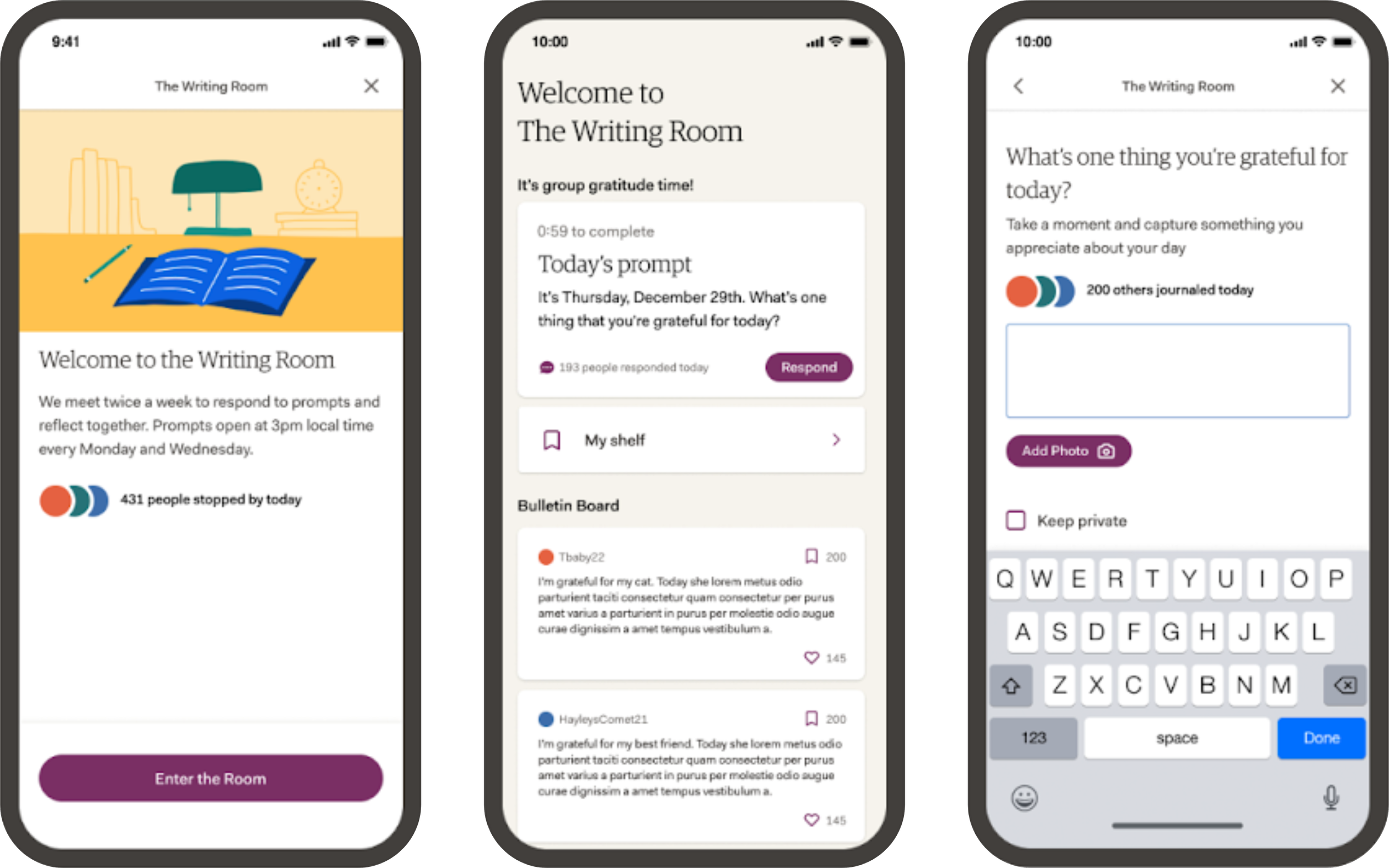
Concept 1: The Writing Room
This option positioned this feature as a space to enter alongside others and journal a response to the same prompt. Writers can pin their response to the room’s bulletin board to share it with other writers, or choose to keep it private. They can also save their favorite responses to their shelf to revisit for inspiration later.
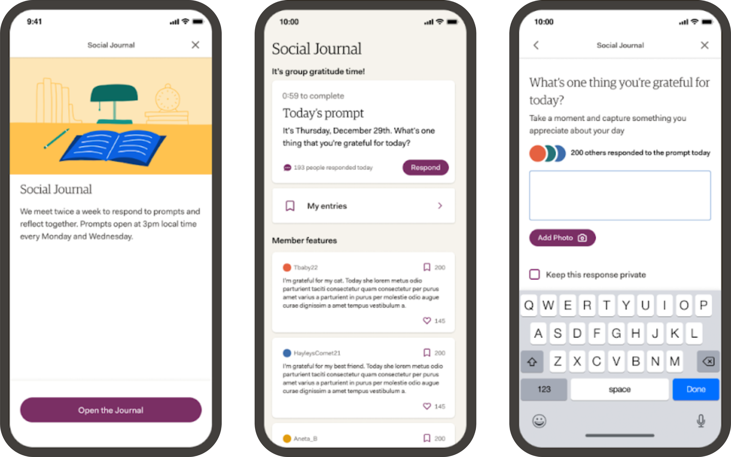
Concept 2: The Social Journal
This option positioned the feature as an online journal (think Live Journal), where users can write and publish journal entries, share them with others, and read journal entries from others.
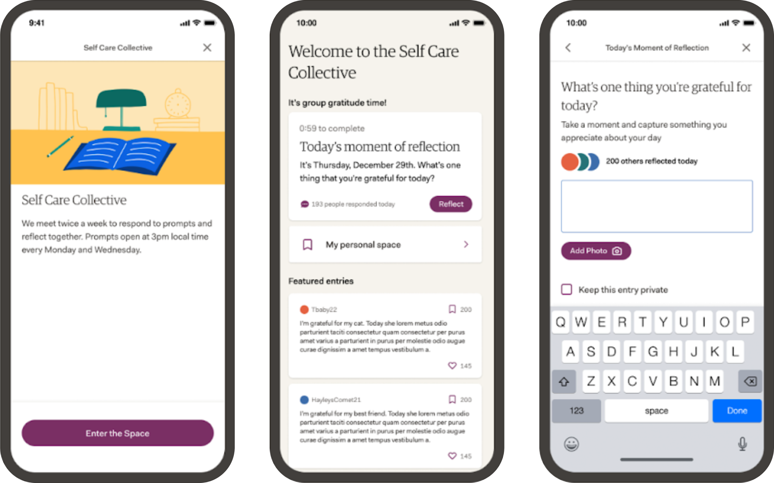
Concept 3: Self Care Collective
Our final option explored the idea of this feature acting as a social network, where journaling is one activity among many, with content shared via a feed.
Step 3
Testing, Synthesizing and Finalizing
Once we felt confident in our 3 options, I designed a user research test on Maze to gather user feedback and explore any existing mental models of the feature concept.
The test included:
10-second test
Free response questions
Naming exercise
Multiple choice question

Method 1: 10-second test
The test started with a 10-second test where we censored any terms within the feature that suggested a certain position.
Method 2: Free Response Questions
We followed up with a series of questions to get users’ uninfluenced thoughts on its functionality, learn what words came to mind when thinking about its functionality, and uncover existing mental models.
Method 3: Multiple Choice Questions
Then, we showed users 3 different versions of the feature, The Writing Room, Social Journal, and Self Care Collective, and asked them to choose their preferred version and tell us why they chose that version.
Synthesis
I synthesized results using Miro. Here’s what we learned:
People instinctively used words like "journal" "community" and "gratitude" to describe this feature
Many were reminded of social media
Users were drawn to actions that felt low-lift
Gratitude journaling was the closest offline action
The Winning Formula
People preferred the Social Journal positioning because it:
Insinuated a community aspect
Felt like a familiar action
Was less intimidating than other options and felt like a low barrier to entry
Iteration and Finalizing
After reviewing the results, we felt confident moving forward with the Social Journal feature positioning, since it mirrored most users’ mental models of the feature.
However, we tweaked the name from Social Journal to Community Journal after seeing so many responses using that term. We also felt that steering clear of the term “social” would help us differentiate this feature from a social network now that we were moving toward a physical journal concept.